P Tower
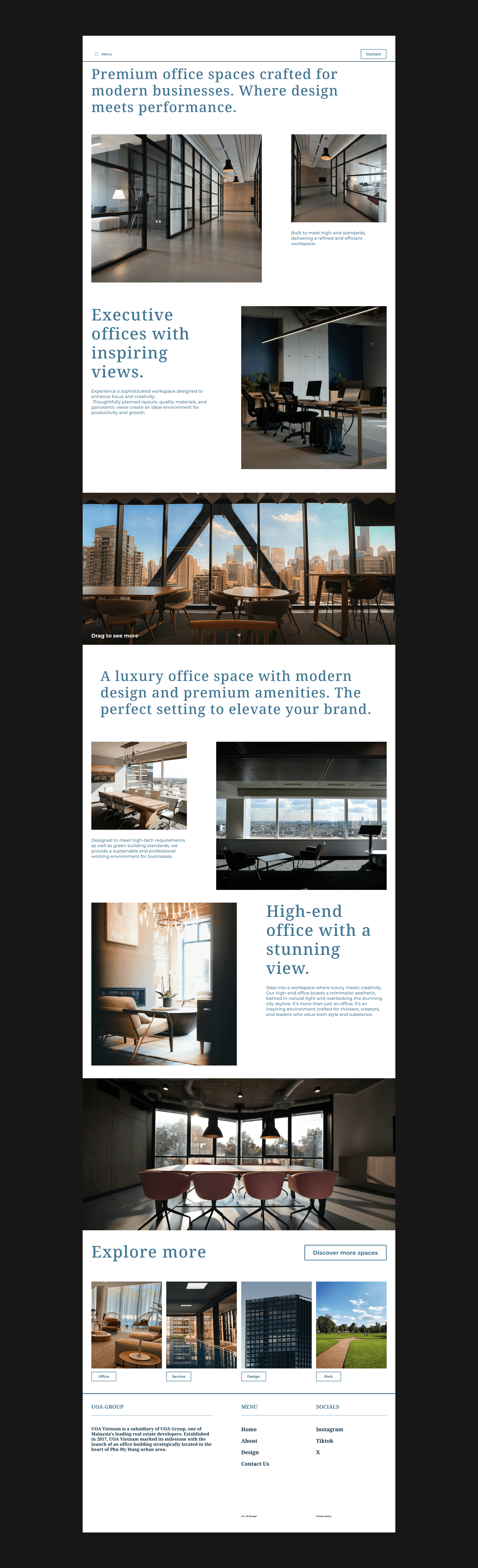
Parc Tower is a design concept for a Grade A office building. The goal of this project was to create a digital experience that reflects the professionalism and high status of a premium workspace. Unlike traditional office websites that only show data, Parc Tower focuses on visual storytelling to engage potential corporate clients.
Most commercial real estate websites are often dry, technical, and filled with too much data. My main challenge was to change this "boring" experience. I needed to find a way to present complex information (like floor plans and technical specs) while still maintaining a sophisticated and high-end feel that matches the quality of a Grade A building.
"Visual-First" strategy.
Space Management: I used a lot of white space to create a "clean" and "breathing" layout, which is a key element of modern luxury design.
Visual Hierarchy: Large, high-quality imagery was placed at the center to showcase the building's architecture, while text was kept minimal and organized.
Professional Palette: I selected a refined color scheme and elegant typography to build a sense of trust and authority for the brand.
Year
2026
Scope
Ui Design
Project
Case Study / Daily UI
Duration
1 Week
Case Study


Story-driven Scrolling
The content is arranged to lead the user through a journey from the building’s exterior beauty to the detailed interior workspace.
Smart Navigation: A simplified menu structure that helps busy business owners find essential information (Location, Facilities, Contact) in seconds.
Responsive Experience: The design is fully optimized for mobile and tablets, ensuring a smooth experience for users who are often on the move.


Conclusion
Through Parc Tower, I demonstrated how to balance high-end aesthetics with corporate functionality. This project helped me improve my skills in creating clean layouts and using visual storytelling to elevate a professional brand.